When it comes to planning a wedding there are many small tasks that have to be performed to make everything look beautiful. People like to divide these large tasks into smaller ones to make work easier for them. Designing and creating wedding invitation cards is one of these tasks. It is further divided into different categories like choosing the best color palette, designing the illustrations for the card, coming up with the theme, choosing the right wording, and choosing the font for the card.
All of these tasks are considered small in their space but when you dive deeper into them they are big. Choosing the font and wording for traditional wedding invitations can be tough. There is enough assistance available on the Internet that can help people in choosing the right wording for wedding invitation cards. Weddings have a lot of stationary and the wording makes them stand out.


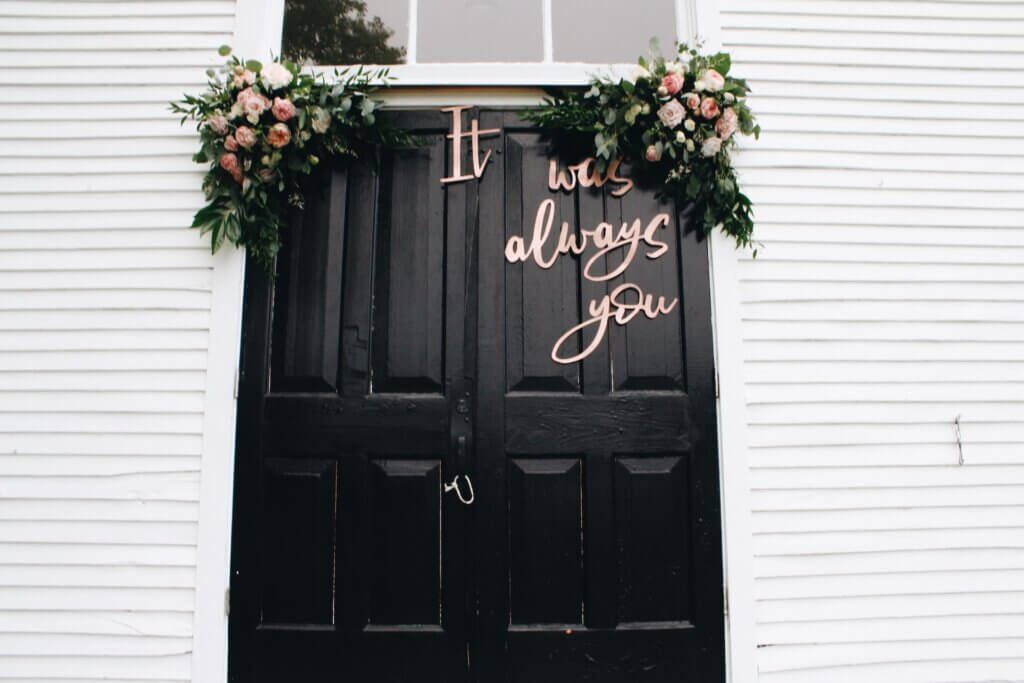
Photo by Brianna Tucker.
Consideration of font style for wedding invitations:
Before choosing the font style for the wedding cards you have to take into consideration what type of cards you want. Some people want to create everything at home, while others want their cards to look professional. The vibe and overall look o the card depict which font style will go best with the wedding invitation card.
- DIY: Many people out there want to sit inside the comfort of their houses and create their wedding invitation cards on their own. They often create magic with their creations. The style of the card usually decides which font will go well with it. Some people have a perception that DIYing everything will help them save money, but sometimes the case is the opposite.
- Semi-custom: Semi-custom wedding invitation cards are designed by professionals but you can make some changes to the card. This is the reason why people leave the minor details for the last and leave the rest to the professionals.
- Fully custom: Lately fully custom wedding invitation cards are personalized on another level. You can go on and on about making changes and the person making your cards will make the changes for you. Whether these changes are in the font size, font, or the wording of the wedding invites.
Best fonts for wedding cards:
The best fonts for wedding cards can be paired together to create magic. Here are some fonts that will give you the desired results that you want.
- Serif: Short lines stemming from the ends of letters are always a good option. Time New Roman is the most recognized Serif font that is used not only on wedding cards but for multiple purposes all around the world.
- Sans serif: Next in line are the fonts that don’t have the stemming lines attached to letters. Some examples of sans serif fonts are Arial and Helvetica. To make your wedding invites look elegant you can use sans serif fonts.
- Script: For a more traditional and vintage look script fonts are used because they resemble cursive writing and calligraphy. Calligraphy on wedding cards is a dream come true. Make sure you explore these fonts for your wedding cards or wedding save-the-dates.
- Display: A display font is more artistic. The font of the wedding card has to match the wording of the card as well. If you are going for an artistic card then use the display font.
Matching the font with the wording and the overall theme of the card is very important. Try and test a few fonts before choosing the one for your wedding invites.
