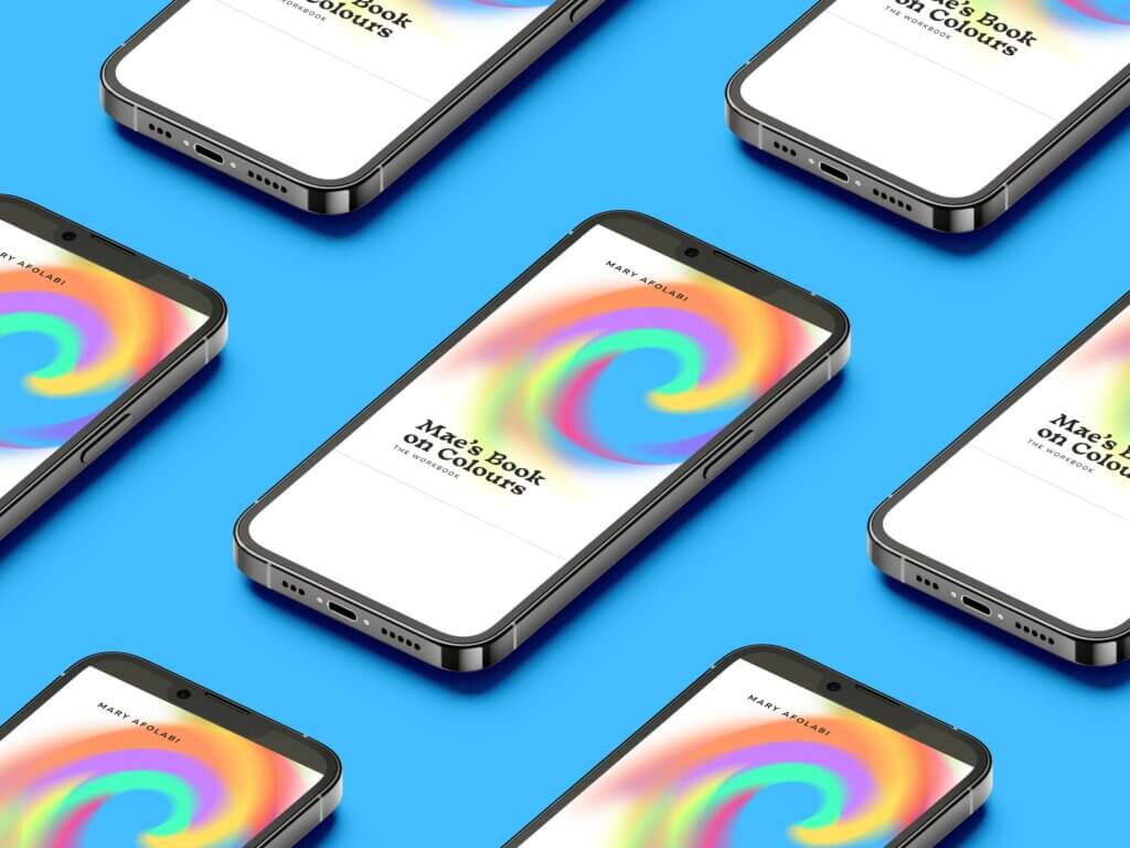
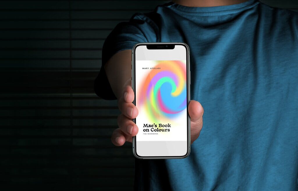
Have you caught the raving buzz on the launch of Mae’s Book on Colours?, it’s the ultimate colour bible published in recent times.
If you’re riddled with questions like “Am I making the best colour decisions for my projects? Is there a quick and easy way to choose the right colours for my designs? Well, this colour bible is the fastest answer for you! Let’s meet the phenomenal brain behind the book, Mary Afolabi!
Mary Afolabi is a Partner & Senior Designer at FourthCanvas, a strategy-led brand design agency in Lagos, Nigeria with 15 years of experience in designing for brands across various industries. She is vastly experienced across Graphics (Print & Digital), Brand (Strategy and Design), Art Direction, and has collaborated on projects for several notable brands across Africa and beyond.
Beyond her excellence in crafting visual experiences, creating systems to ease processes, and inspiring amazing designers, Mary has a deep understanding of the psychology of colors and collaborates on design projects to determine strategic color systems.

Source: Mary Afolabi
Hey Mary! First off, huge congrats on your book “Mae’s Book on Colors” – it sounds like the ultimate color bible for designers. So spill the beans – what inspired you to create this ‘rainbow-tastic’ guide?
Hey hey!
Thank you so much! Yes, it is the ultimate colour bible for creative people; designers and even photographers.
As a little girl, I had always been fascinated by visual arts. By the time I was in Uni I decided to major in painting because I enjoyed mixing colours, and making paintings felt like an escape into another reality where I was always in a state of flow. Then my journey took a new turn where I got exposed to the psychology of colours and how colour is experienced differently all over the world, because of different world views. All of that led me to discover colour on a deeper level, to see how much human decisions were dependent on colour on a subconscious level!
I have gone on to study an insane amount of materials (covering colour across several industries), taken courses and embarked on research to understand colour better. In all of this, I found that there’s no book yet that specifically talks to designers, helping us make better colour choices. There are books that detail how colour decisions were made for live projects, showing the intuitive nature of creators who make colour decisions, but nothing that makes it easy to solve unique project colour problems, with a hit always.
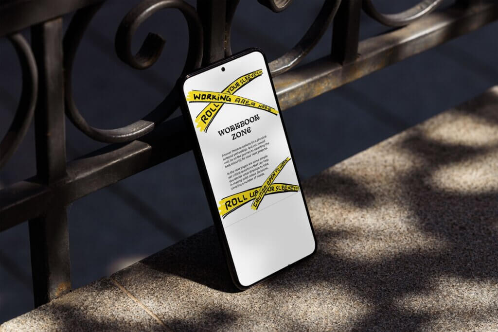
That was the point of this book project: show creatives how to make informed colour decisions that are on purpose or influenced by the essence of a brand or projects. The flow of the book will lead a reader into the introductory notes and then a workbook part which is quite versatile in that it covers important leading questions for different project types, from brand and product design, to photography.
Source: Mary Afolabi
Now, we all know choosing colors can sometimes feel like trying to decide on your favorite ice cream flavor (seriously, how do you pick just one?). What’s your secret sauce for helping designers navigate the chromatic jungle with confidence?
True! It is quite a task, trying to figure out what colour is perfect for a product, brand or a project. There are so many colours out here and what most designers would do is to outsource the task of making a final to the almost all-knowing search engines. Even with that, one might worry if there’s a better (or perfect) colour for a thing.
My secret sauce is to start from the essence of the thing you need to create a colour system for, just like we start from the “why” for the most important things we embark on. The what, why and who questions give me the most clarity to navigate this decision with confidence. What are we designing the colour system for? Why does it exist? What role does this play in the lives of the target audience and who will interact with these colours?
Your answer from that leads you to making the best colour decisions to start from on any kind of project: design or photography.
They say colors have personalities – imagine colors walking into a party. Which color would be the life of the party, and which one would be the shy wallflower?
Hahaha, love this question.
Colours have personalities, indeed! Red would be the hot, sexy and desirable one. Orange would be the friendly and warm person; Yellow would be the life of the party, infusing high energy into everything! Blue would be pretty chilled, okay to be alone, but Grey would definitely be the shy wallflower!
Your book is all about making “badass choices” when it comes to colors. We’re intrigued! Can you share a sneak peek of your favorite tip or trick that can instantly transform a ‘meh’ color combo into a jaw-dropping masterpiece?
This is a trick that can work for any type of project: clarity of purpose. A ‘meh’ colour is most likely not fitting into purpose. With clarity, it’s easier to judge what does or doesn’t work per time.
Outside of that thick answer though, contrast between colour tones can also take your combos from 10 to 100! At most, a colour palette or combo should have three tones: dark, mid and light tones. For the best results.
Source: Mary Afolabi
Alright, Mary, spill the (color) beans 🤣 – have you ever faced your own colorful disaster while designing, where you looked at it and thought, “Well, this wasn’t quite the plan!”?
I cannot remember the last time that happened, OMG! I haven’t had a colour disaster (that stayed unfixable) on projects in ages and I’m not making this up.
I had a close one on the rebrand project for Kudi (to Nomba). They needed a complete overhaul of the colour system and we (the client and my team) couldn’t agree on a new colour direction. It seemed like every colour was taken and the tricks in my bag weren’t working. They wanted nothing from the old colour palette, yet almost all the available combinations were gone!
In the end, we found a unique approach to making the system work by adding greys and balancing out the experience via the use of patterns. Case-study is shown in my book by the way.
Now, we’ve all had that “I-need-another-set-of-eyes” moment when choosing colors. What advice would you give to a designer who’s torn between two shades and stuck in a chromatic conundrum?
I know this moment too well!
Most times, when you’re torn between two shades, they’re mostly alike in a lot of ways. Like making a choice between a deep purple and burgundy type of situation. Also, most times, any one of the two colours would work, but you’re worried you’re making the right choice as you seal the fate of a business or a project to that specific colour.
My advice is for you to go through sorting pros and cons for each colour, confirm again which one connects to the purpose or the true emotions of the brand or project. Then make a decision!
Your book sounds like the ultimate sidekick for designers, helping them become color maestros. But if “Mae’s Book on Colors” were a superhero, what would her superpowers be?
Haha.
Most likely Nick Fury; the coach that keeps people grounded in colour mastery with every encounter!
They say colors can affect our moods. If you had to choose a color palette to conquer a Monday morning blues epidemic, what colors would be your trusted warriors?
It depends on how serious the Monday morning blues are. Winks.
I think any warm colour would do just fine. Or, a bright coloured cool colour. Again. Buy and read my book to understand this one better.
Sometimes, black is that power colour that can give you the energy you need to power through your Monday goals. Winks.
Source: Mary Afolabi
You’re a designer and now an author – double threat! If you could give your younger self a single piece of advice about colors, what would it be?
It would be to start talking more about colours!
Colour is beyond being just physical, it goes deep to affect our moods, decisions and the more intentionally people approach this, the better.
So start talking a lot about it. People are going to be scared to play. Instill colour confidence in them, Mae.
Finally, Mary, (we’ve got to know) what’s your personal go-to power color that makes you feel ready to take on the world, design-wise?
Almost hard to say.
I don’t start with the colours that please me. I start from purpose. If I ever choose a fave, it doesn’t take me too long to get back to judging if it fits into purpose!
Thank you so much for sharing these amazing insights with us Mary.
Mae’s book on Colors is available on sale here
Source: Mary Afolabi